Every pixel has a specific hue, saturation, and brightness value, shaping what you experience. People and businesses aren’t so different. My role is translating your purpose into design that's easy to manage and hard to forget. Jobs in advocacy, membership services and architectural planning, taught me people often know what they want, but not always what will work...for print, web, or people. Here's my approach:
Doing my best to do good for all is important to me. Partnering with businesses who feel the same accomplishes more than I ever could alone.
What keeps me sharp and is going to make you shine in your industry is more then applying best practices. Get ready to explore unfamiliar territory with me.
I can't pronounce it either. But working in cycles of research and testing solves problems, reveals opportunities/risks, and saves costs. Nothing great was built in a day.
I am not a mind reader...yet. So your input is paramount. It enables us to establish our boundaries, goals, workflow, concerns, deadlines, etc.
Visual Brand Audit 2025
Work in progress. Update expected before 2026. Keep scrolling to view more projects.


Visual Brand 2025
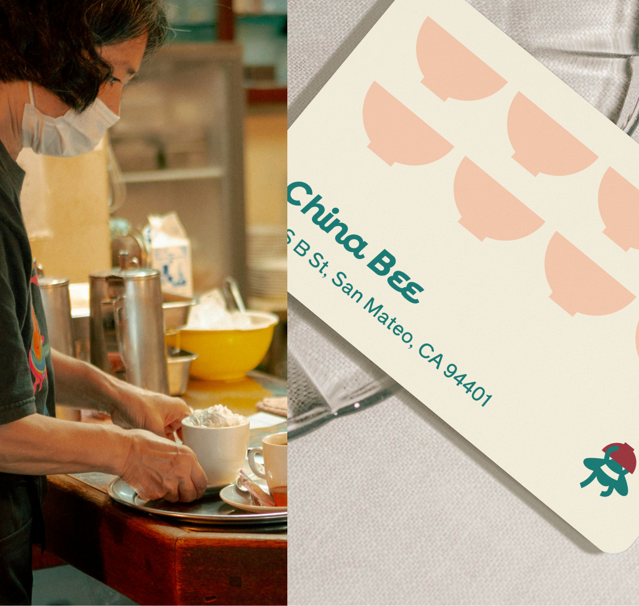
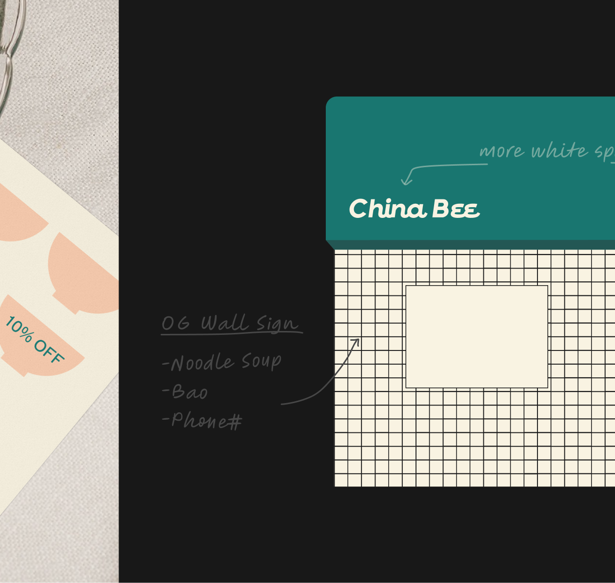
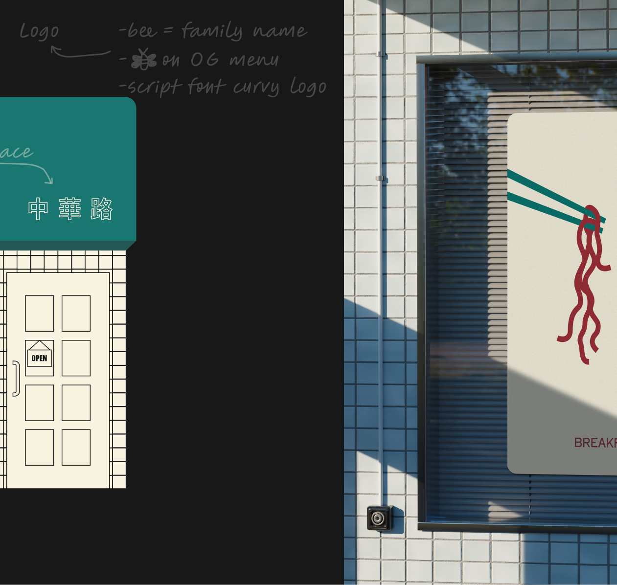
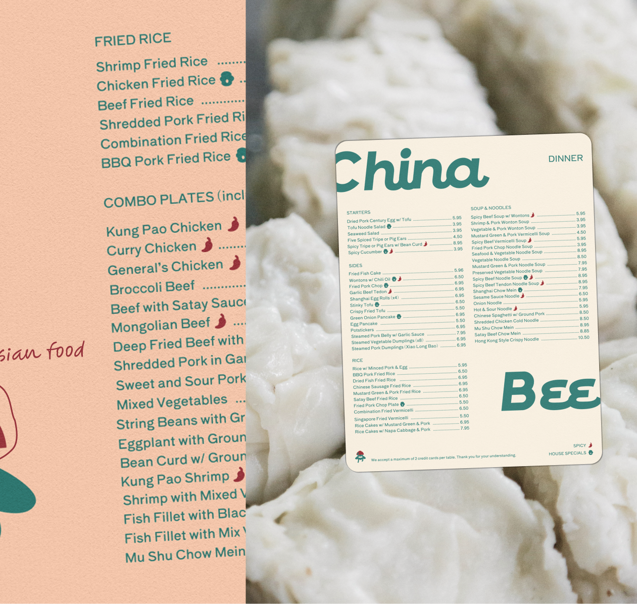
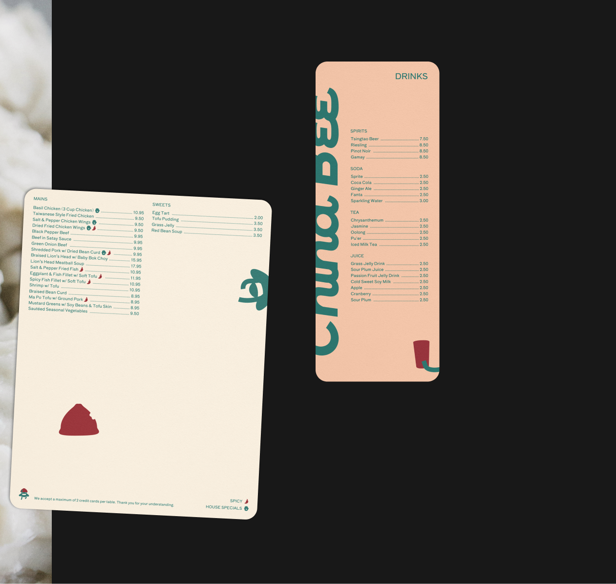
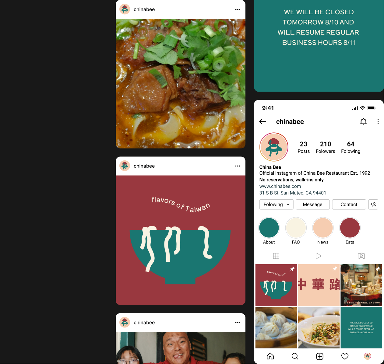
This project is an ode to the businesses, often family-run, that just stick with us. I brought one of mine back (online) using heritage colors, real menu items, and a bespoke mascot the Bee family’s restaurant never had. Thank you for all the good eats China Bee.
Their diners, which are families and 20s-40s foodie nostalgia seekers, like restaurants that are authentic, cozy, and easy to navigate, says market research. The owners don't need more work added to their plate. Drivers for the brand design are heritage and low-effort components. For example, the color theory, which takes after the original storefront, is Taiwanese—red for prosperity, green for vibrant island nation, and pink for love (of their most ordered). And a two-page website makes navigating and ordering simple.

Visual Rebrand 2025
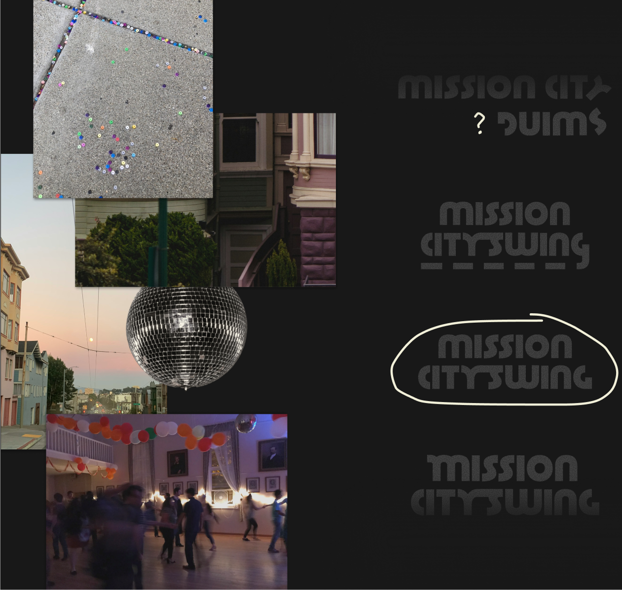
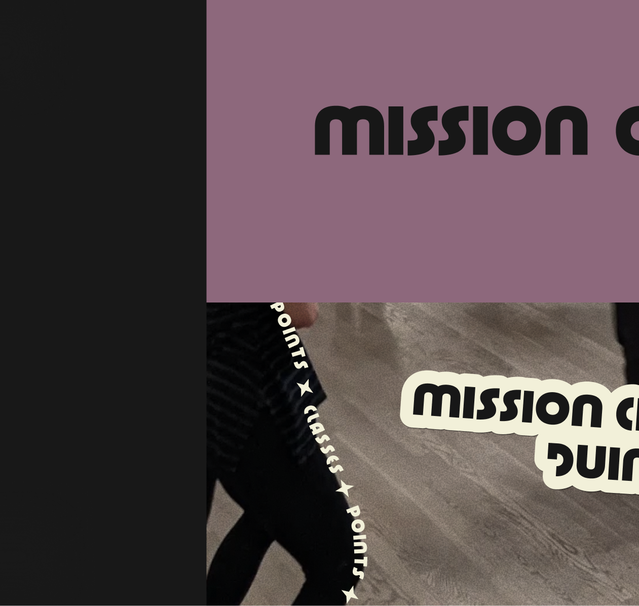
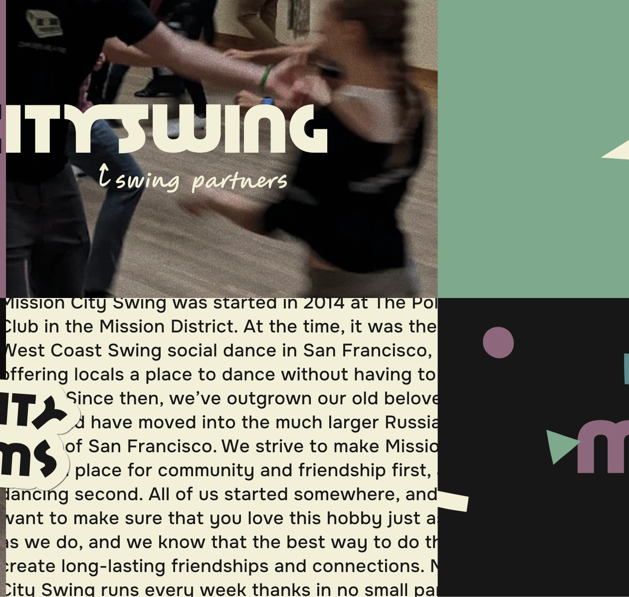
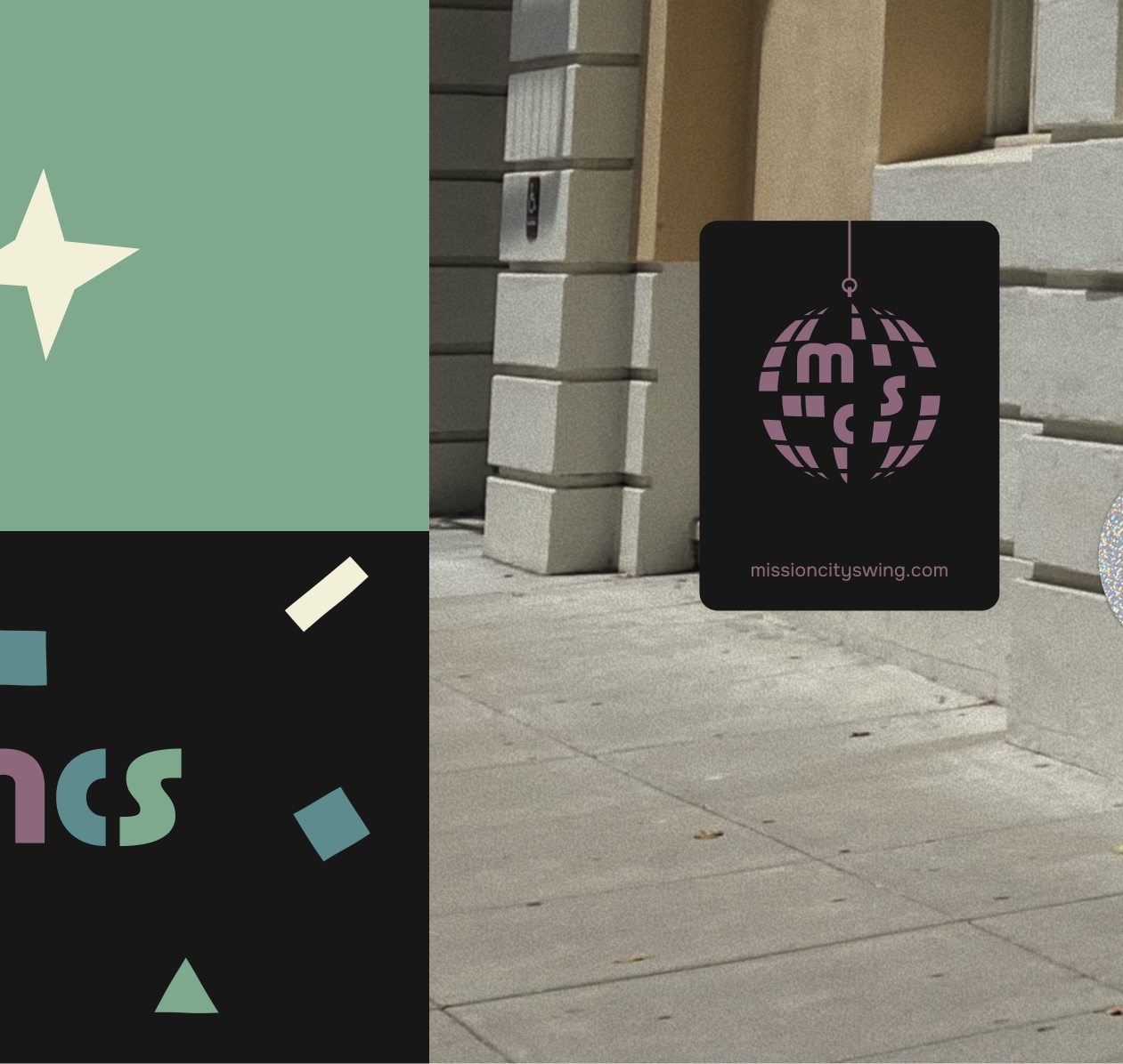
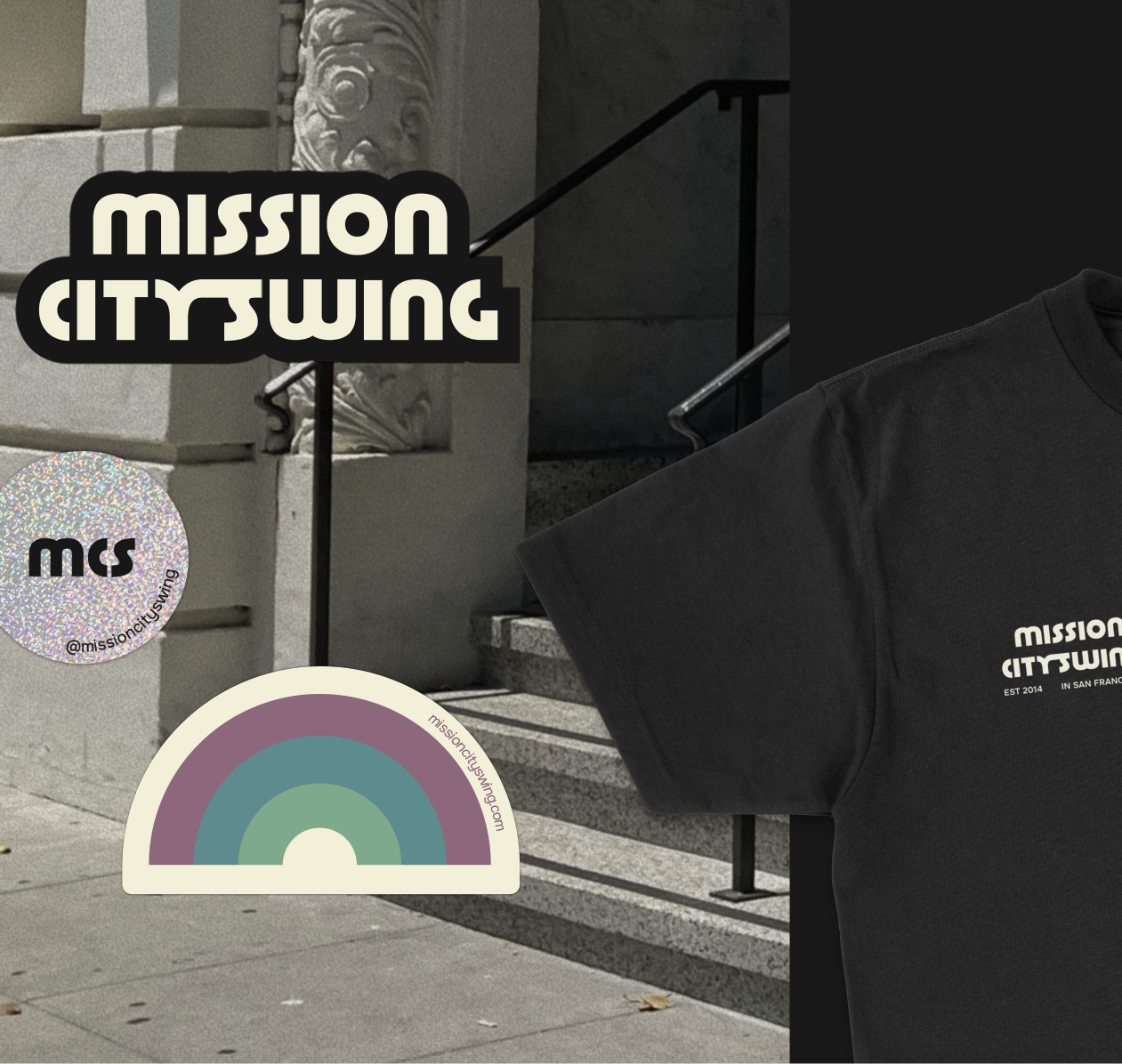
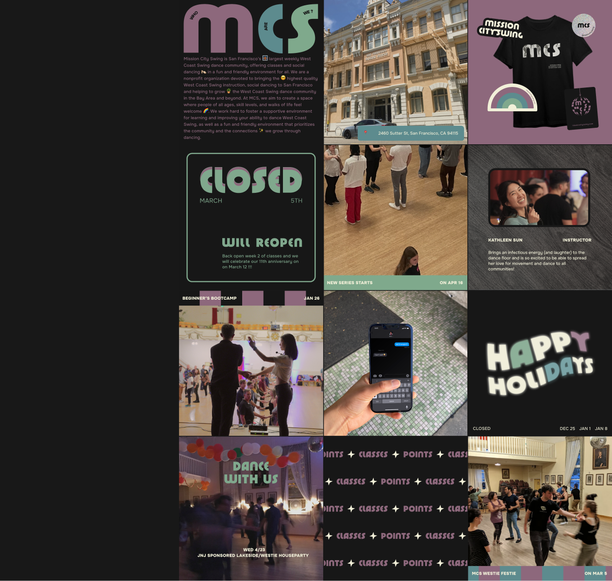
Mission City Swing dance studio was looking for a new full-name logo, a boogie-vibes color palette, fresh fonts, and a dark mode website reboot their fully volunteer-run organization can implement over time. Proposal request challenge accepted.
There's a lot packed into this rebrand (other than BST)... almost like a time capsule, containing snapshots, artifacts, and messages specific to this inclusivity-minded community. The goal was to transport people, not back in time, but under the glow of a disco ball on the MCS dance floor, serving art deco, jazz, lindy, tap, disco and hip hop vibes.

Visual Brand 2024 — 2025
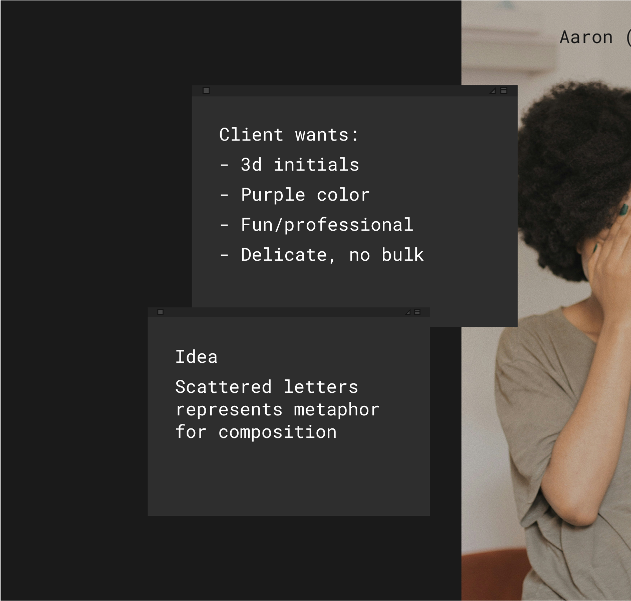
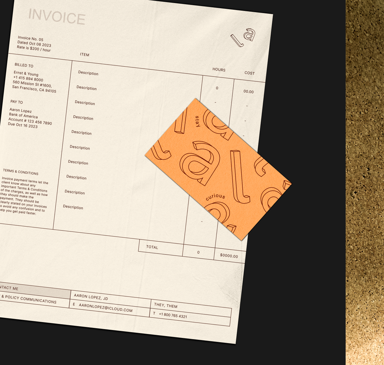
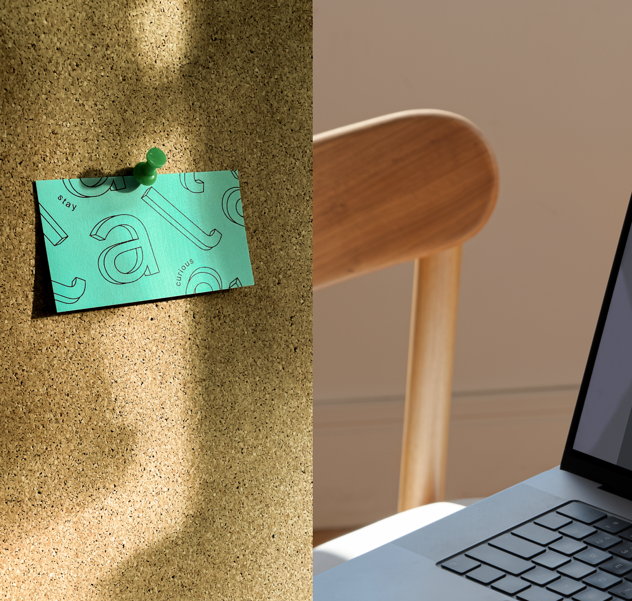
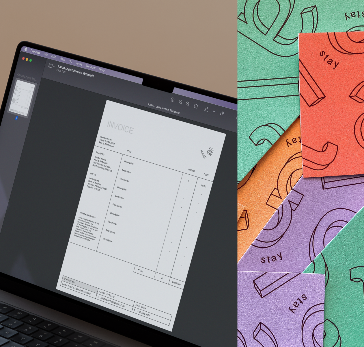
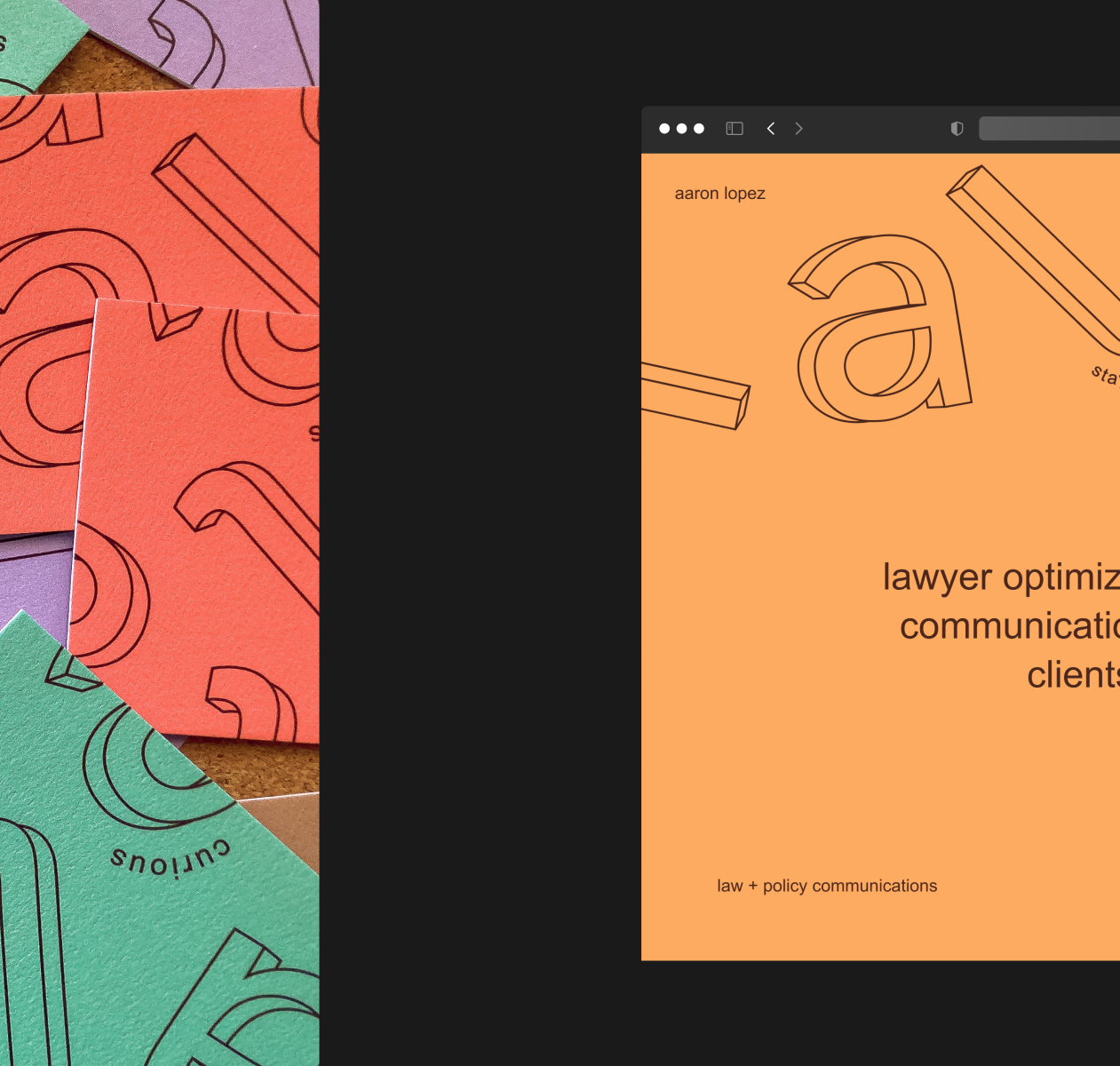
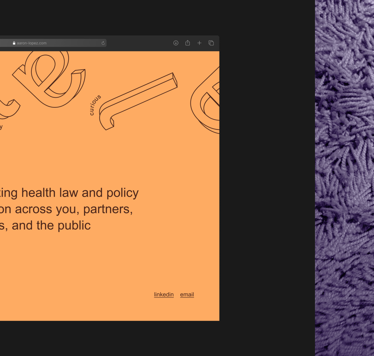
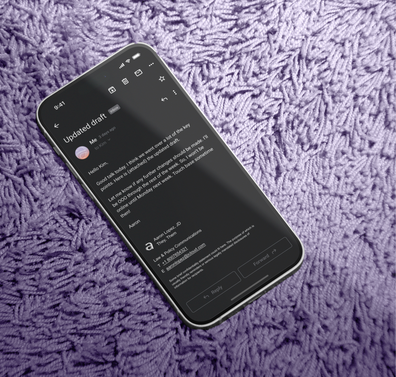
The client (unnamed because I respect designer-client privilege) was a lawyer consultant helping organizations with law and policy communications—less courtroom drama, more research, strategy, and well-placed footnotes. They wanted a visual identity that looks polished but also reflects their easygoing personality to stand out among the usual stiff suits. "Stay curious" is their slogan of choice.
Deliverables included logo variations, a color palette that won't bore or blind and free and foolproof fonts (winning!), a landing page that’s more sidekick than sales pitch, plus some templates to free up time.

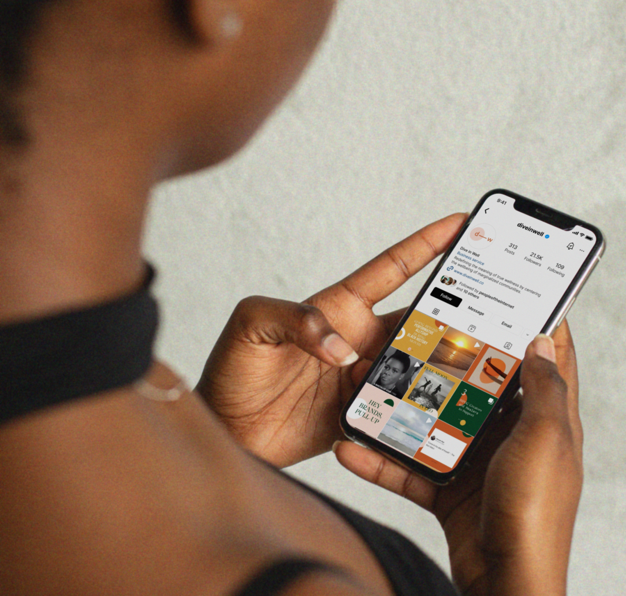
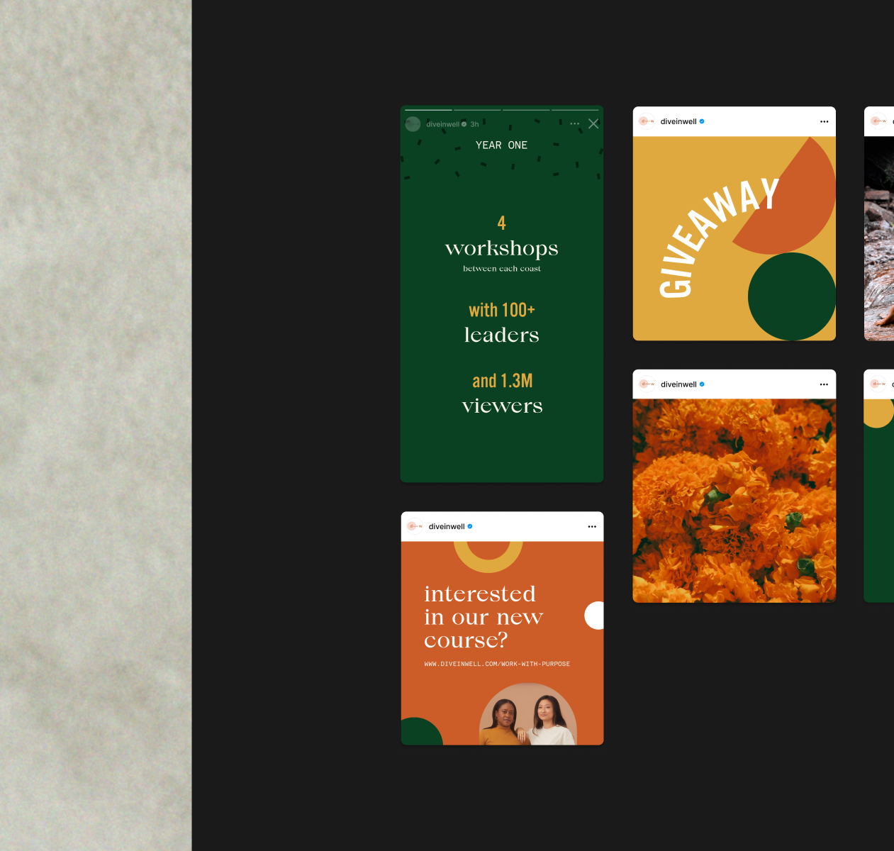
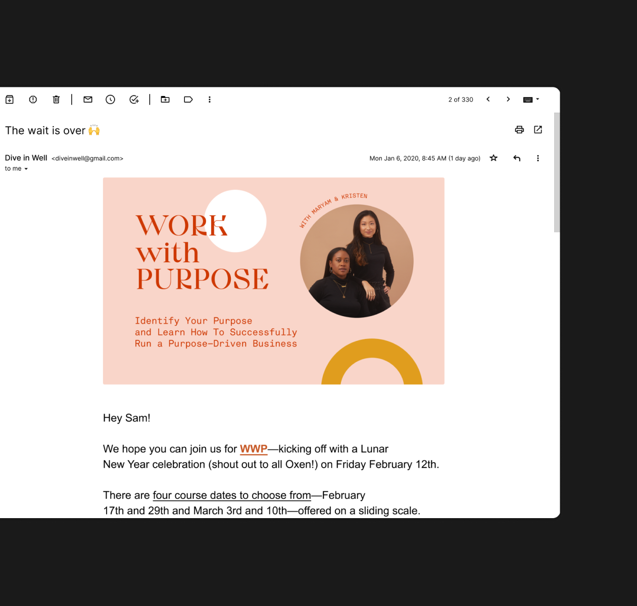
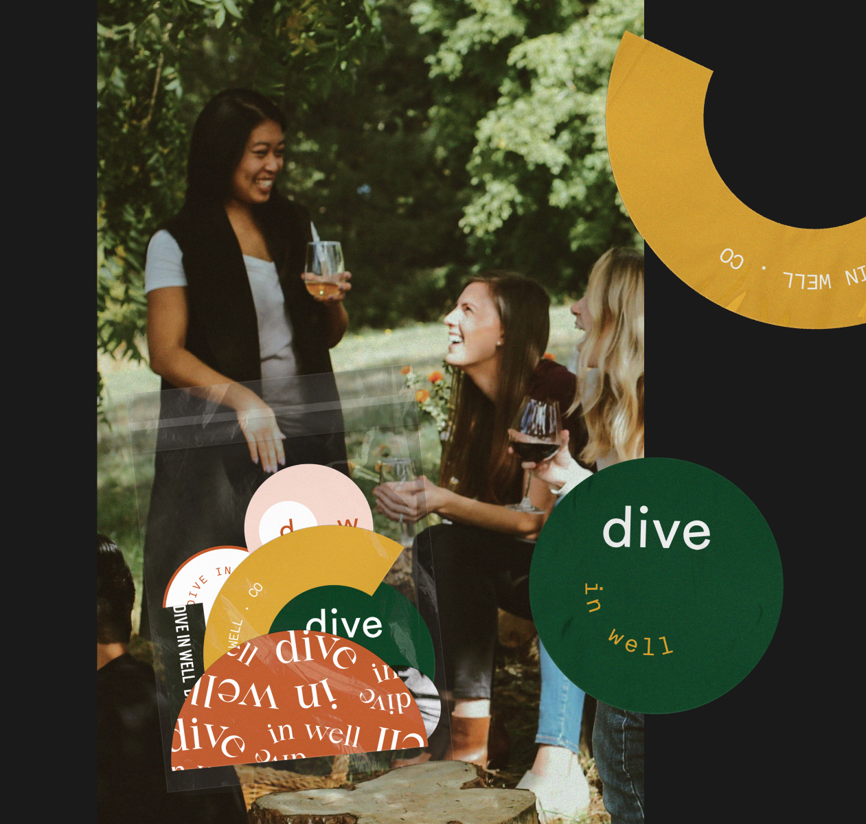
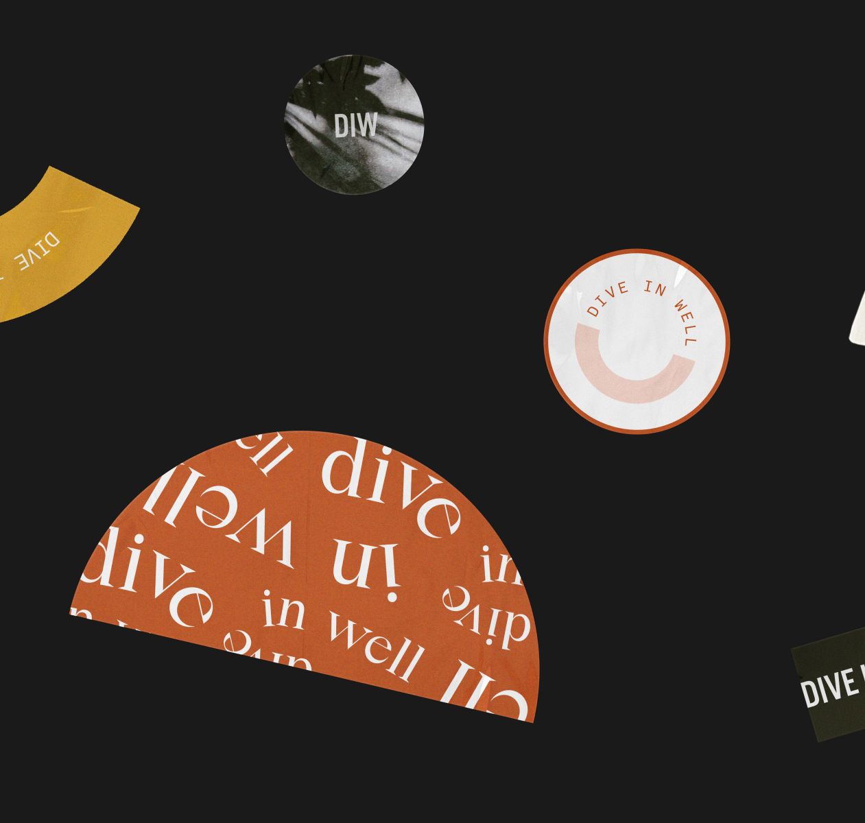
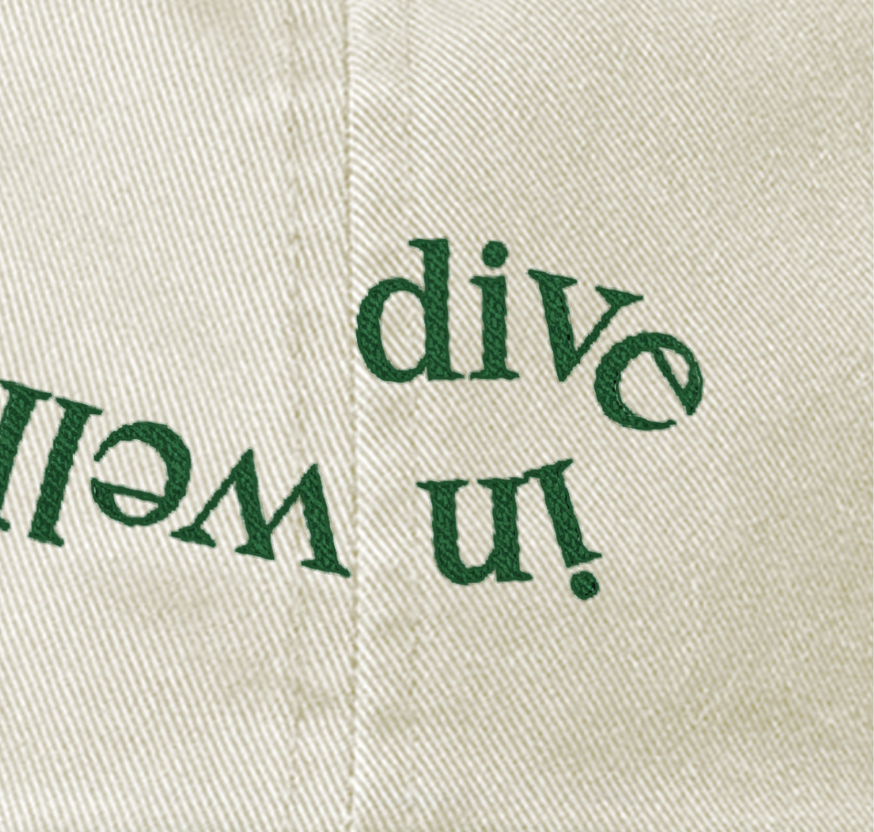
Graphic Design 2020 — 2021
Through sponsoring and organizing since 2020, Dive in Well has elevated countless small wellness businesses, increasing chances for each of us to find our zen (or at least try). Dive in!
I teamed up with the head of strategy (unamed, but unforgettable) to schedule and produce weekly graphics for social and email media. The result? A 10% follower jump in just two months—proof that sometimes my ideas work. I also took the reins on sticker and hat products, while the brand identity came from the talented senior designer Neo Khama.